
Context
DadQuest: That Time I Pushed My Nerdy Son Out of the Way of a Truck and Got Trapped in a Magical Fantasy World Where Everyone is Short and Has Weird Colored Hair, Also They Want Me to Tame a Dragon by Simon Miller is a comedic fantasy book published on Amazon in both print and digital formats. Below is a synopsis of the text.
DadQuest Synopsis
Dave is not a hero. He’s a middle-aged mechanic with a bad back. But when he pushes his son out of the way of a truck, he ends up in a crater in a magical forest, and is quickly found by a diminutive wizard who thinks he’s there to tame a dragon.
Everyone seems to expect great things from Dave, but he’s more realistic. He can’t go around riding dragons and slaying monsters—that’s a young person’s job. But that won’t stop the townsfolk from asking him to solve all their problems. And when people are in danger, will he really be able to just sit by?
Monsters roam in the forest, and great blasts of flame are coming more frequently from the castle on the hill. Will Dave be able to rise to the challenge? Whatever happens, he’ll be using all of his dad skills and telling some terrible jokes along the way.
Result
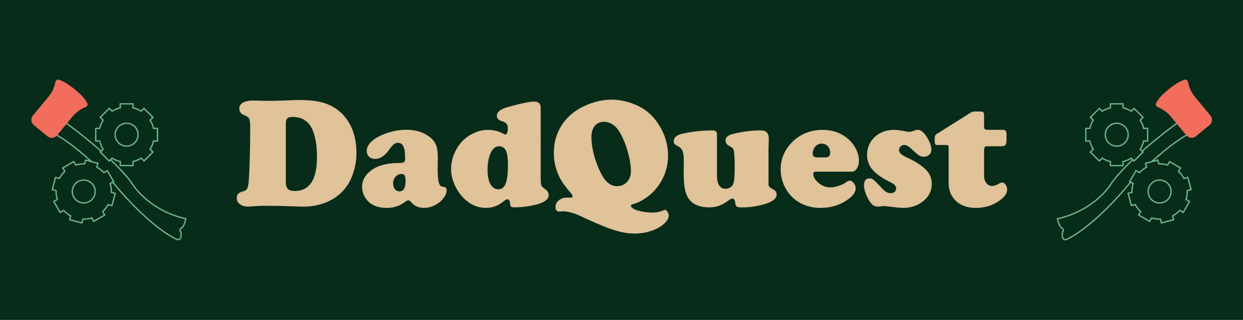
Over the course of two weeks, designed the entirety of a 260+ page text, an eye-catching book cover, and various types of images used for marketing and promotion. The Brand Identity of the book is established through various means, inspired by Instruction Manuals, BECMI era book covers, and the heavy ‘dad’ themes of the text.
The Process
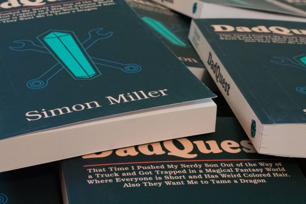
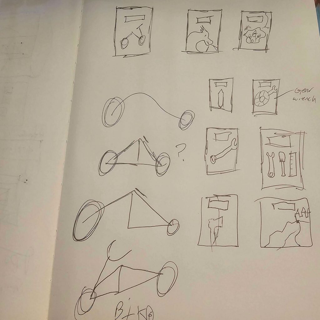
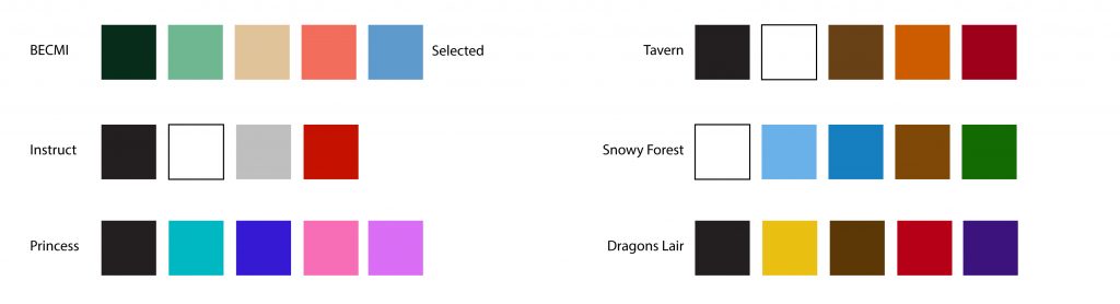
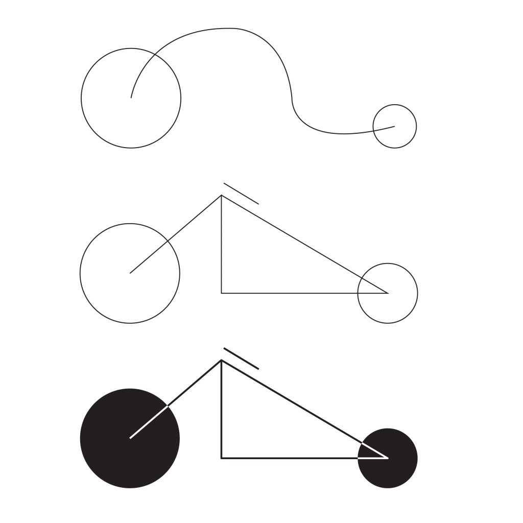
Sketches for the cover of DadQuest were made as well as several color palettes before choosing one that best fit the themes of the text. While the cover was created and shown to the client for approval, the print copy of the text was developed by creating a master template for the book, then choosing a typeface and developing an image to use in the inner cover.
Once the cover was approved, the interior design of the text was inspected for flow, page turns, and then User Tested. When the proof copy arrived, it was given an intensive quality check before necessary changes were made and submitted for final publication.
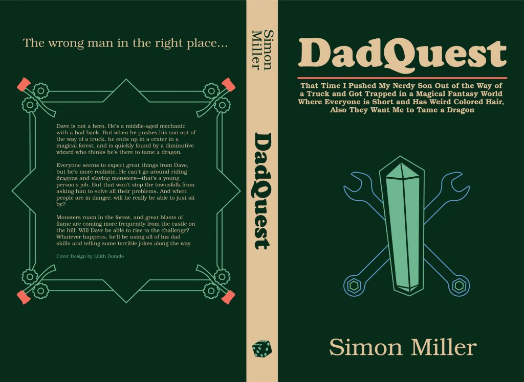
Judge a Book by its Cover
The Inner Cover, which has the Icon as seen above, is a piece of foreshadowing and reference to important plot points in the novel. The image is of a stylized motorcycle, which is critical to the climax of the story. The icon is meant to be something that looks strange to the reader at first, and at the end becomes a fun reference and aspect of visual foreshadowing.
The Outer Cover was designed to look like the outside of a User Manual and have a distinct “dad” and “nerd” feeling. The Outer Cover, while atypical for Fantasy novels, was designed so that it would stand out. Furthermore, the Icons on the cover are references to characters, events, and important concepts within the text, making the cover something that a fan would greatly appreciate after finishing the novel.
Conclusion
An entire book was formatted and designed with a cohesive Brand Identity that allows the book to be promoted easily. Furthermore, the cover design relates to the themes of the text and contains foreshadowing in ways that readers will enjoy afterward. The book cover, by admission of readers and client, has been one main draws to purchasing a physical copy of the text over a digital copy. The Amazon store page where DadQuest may be purchased is located below: