Context
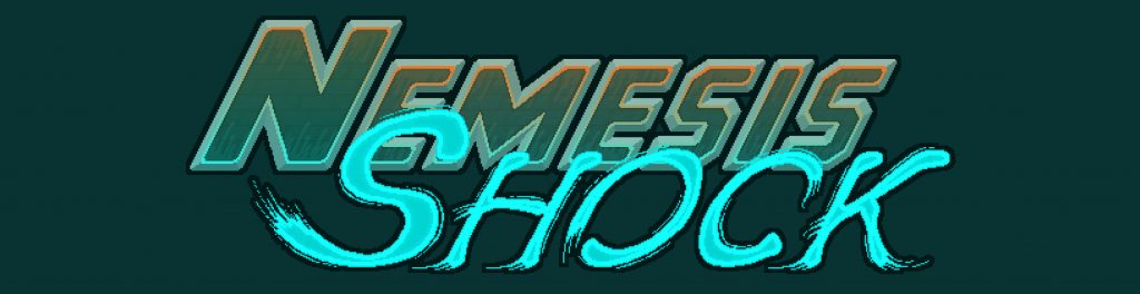
Nemesis Shock is a twin-stick roguelike game by the indie studio Orange Crater. The studio hired me to produce promotional materials for their appearance at the Seattle Indie Games Expo and for assistance in designing their booth. At time of writing, a demo of Nemesis Shock is available on the studio’s Itch.io and Steam pages.
Result
Orange Crater had a large catalog of preexisting assets to use as references. I was able to utilize a subset of the existing color pallet, seen below, and adapt the pixel art style seen in-game to maintain a cohesive design for promotional materials.
The Process
The process began with a consultation. Many options were presented, and the customer decided to create informational diagrams for control guides, a banner, a lore sheet, and business cards with a QR code for promoting the game.
After the Consultation, a color palette was decided for all the physical materials. The game has a varied array of colors, which were used as inspiration for the design of physical promotional materials. Below are various examples of the color combinations that were considered.
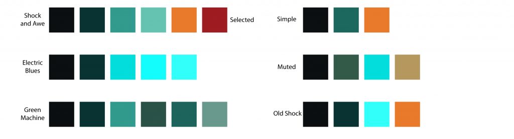
The ‘Shock and Awe’ option is the selected color combination and was used on each promotional material. The game uses various shades of blue, green, and red for emphasis. I synthesized this with the orange from Orange Crater’s logo, and developed the color choices seen above. The colors are used throughout the print designs.
Guides, Guides, Guides!
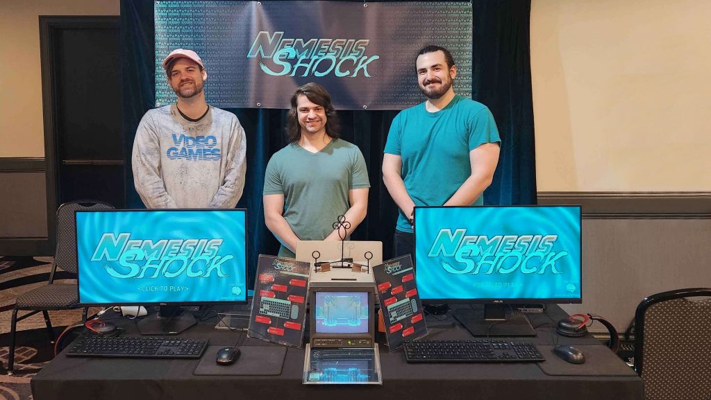
While banners and business cards are important for advertising a product, for this expo, the higher priority was a set of Guides to simply and effectively communicate the core mechanics of the game. A meeting was scheduled with one of the lead developers, and we discussed what content was most important. The most critical Guides ended up being the Control Scheme; although this was displayed in-game, having a printed guide allowed it to be passed around and used as a quick reference. This improved the flow at the booth and was critical to Orange Crater’s success at the expo.
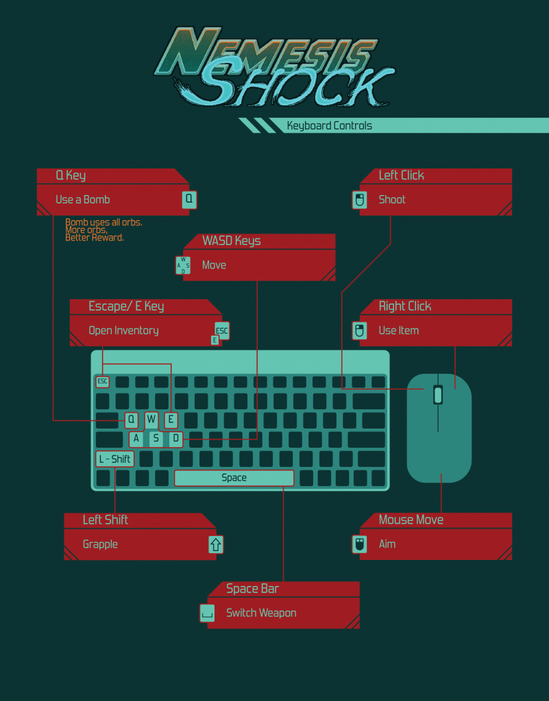
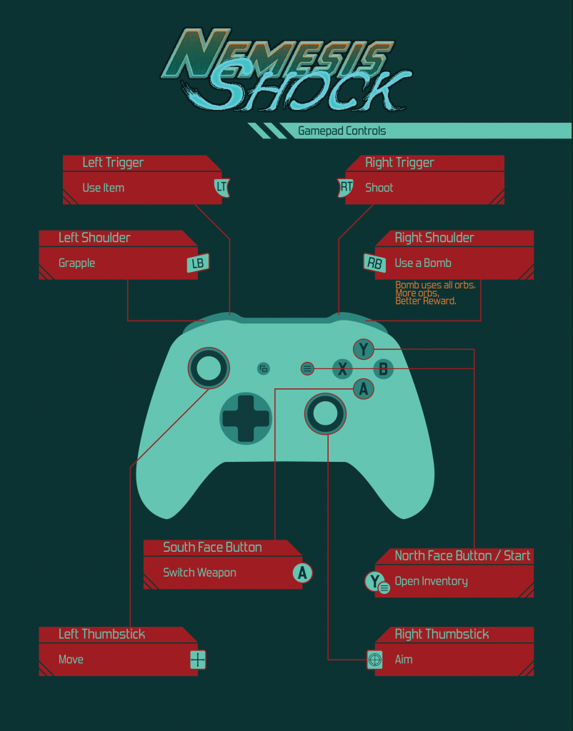
The Guides are double-sided and laminated so that they may be used and passed around without risk of wear and tear. The other Guide, another double sided 8.5 x 11 sheet, was made with Simple ‘How to Play’ information along with some descriptions for in-game enemies.
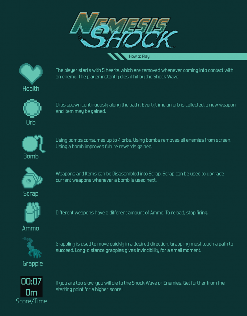
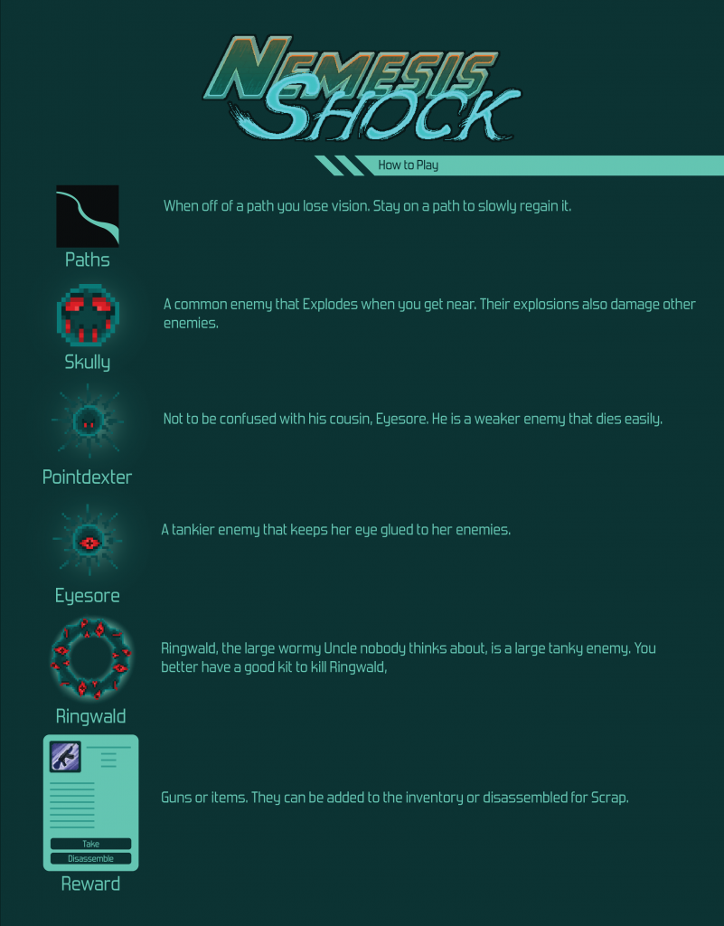
The How to Play guides were created using in-game icons and graphics. Simple The simple pickup items were explained in detail on the front, while the reverse gave names and details on the enemy types.
The Nemesis Shock Banner
A banner size was decided according to the space that the Game Studio was allotted for. I estimated a length of 6 feet and a height of two, with grommet placement on the four corners and every 1.5 feet. The banner consists of the Nemesis Shock Logo and branding, which has been described above. Orange Crater’s logo is present in the background as a texture alongside Caution signs, as if one were receiving an emergency warning; this is a common trope in the mecha genre.
Cards and QR Codes
Business card-sized handouts were required by Orange Crater, and I elected for a two-sided layout. Orange Crater wanted something simple and dynamic, as well as their Game Studio logo present. A QR code was created and placed on the cards and developers were instructed to suggest the cards can be used as bookmarks, in the hopes of creating less waste.
Conclusion
Several pieces of branded content were created for the game Nemesis Shock, which led to the developers gaining wishlist’s on Steam, as well as having hundreds of people play the demo. In addition to the successful launch of the Nemesis Shock demo, I assisted in marketing of the game through social media channels. The Steam and Itch.io page for the game can be found below.